Introduction to CSS
CSS (Cascading Style Sheets) is a styling language used to define the visual appearance of documents written in HTML or XML (including variations like SVG, MathML, or XHTML). It controls how elements are displayed across different media, such as screens, print, or even speech.
CSS is one of the fundamental languages of the open web and is standardized across all major web browsers based on W3C guidelines. In the past, different parts of the CSS specification were developed together, which made it possible to label them as versions—like CSS1, CSS2.1, or CSS3. However, there won’t be a CSS4. Today, everything is simply referred to as "CSS," with individual modules updated and versioned separately.
CSS Selectors
A CSS selector is the starting part of a CSS rule. It defines a pattern that tells the browser which HTML elements to target so the styles specified in the rule can be applied to them.
Selectors, whether used in CSS or JavaScript, enable targeting HTML elements based on their type, attributes, current states, and even position in the DOM. Combinators allow you to be more precise when selecting elements by enabling selecting elements based on their relationship to other elements.
.elementID {
  color: black;
}
Selector Types
A type selector targets all elements with a specific tag name.
- For example, div selects every element, while input targets all input elements.
- The universal selector, written as an asterisk (*), is a special type of selector that matches all elements.
- The class selector targets elements with a specific class attribute, using a period (.) before the class name—for example, .index will select any element with class="index".
- The ID selector targets elements by their id attribute, using a hash symbol (#) before the ID—like #toc, which selects the element with id="toc".
While class and id are both global attributes, only one element in a document should have a specific ID. However, if multiple elements share the same ID, the ID selector will still match all of them.
When creating compound selectors, the type or universal selector should come before the class or ID selector. For instance, div.index targets elements with the class index.
* {
  font-style: italic;
}

p {
  color: black;
}

.class {
  text-decoration: none;
}

#id {
  font-family: helvetica;
}
CSS Box Model
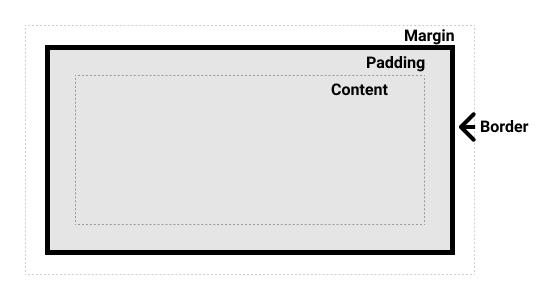
In CSS, every element is surrounded by a box, and understanding how these boxes work is essential for building more complex layouts or aligning elements effectively.
The CSS box model, which primarily applies to block-level elements, defines how the content, padding, border, and margin combine to form the visible box on a webpage. Inline elements follow only parts of this model. To make things a bit more intricate, CSS also offers two different box models: the standard model and an alternate one.
Box composition
These components make up a box:
- Content box: This is where your actual content appears. You control its size using properties like width and height.
- Padding box: The padding sits around the content as white space; size it using padding and related properties.
- Border box: The border box wraps the content and any padding; size it using border and related properties.
- Margin box: The margin is the outermost layer, wrapping the content, padding, and border as whitespace between this box and other elements; size it using margin and related properties.
Below is an illustration of the layers forming a box:
Layout
CSS layout techniques give us the ability to position elements on a web page based on several factors: their default placement in the normal document flow, their relationship to surrounding elements, their parent container, and the overall browser window or viewport.
The three types of layouts in CSS are:
- Flow - Flow layout or normal flow
- Flex - Flexible box layout or flexbox
- Grid - Grid layout
CSS Flow Layout
Normal Flow or Flow Layout, is the way that block and inline elements are displayed on a page before any changes are made to their layout. The flow is essentially a set of things that are all working together and know about each other in your layout. Once something is taken out of flow it works independently.
Inline elements will display themselves in the inline direction. This means, in the direction words are displayed in a sentence according to the Writing Mode of the document. Block elements display one after the other, as paragraphs do in the Writing Mode of that document. To put it in more simpler terms, inline elements display one after the other, starting on the left, and block elements start at the top and move down the page.
.inline-element {
  display: inline;
}

.block-element {
  display: block;
}
Once an element is displayed on a page inside the normal flow, it can be further adjusted with the position property. The position property allows you to precisely control the placement of boxes inside other boxes. static positioning is the default in normal flow, but you can cause elements to be laid out differently using other values, for example, fixing them to the top of the browser viewport using position: fixed.
The possible values for the position property include:
.element {
  position: static;
  position: relative;
  position: absolute;
  position: fixed;
  position: sticky;
}
Another CSS property that allows us to further position an element in the normal flow is the float property. Before CSS Flexbox and Grid, the float property was used to allow block elements to be positioned next to each other on the same line. Now, Flexbox and Grid are used for this and the use cases for the float property are now more limited.
CSS Flexbox Layout
The CSS flexible box layout allows us to specify an element as a container element. This container element is known as a flex container. When a flex container is created, the direct children of the container are then represented using boxes that have flexible sizes. By saying flexible sizes, we mean that the boxes can either grow or shrink in size to fit inside their parent element, the flex container.
To configure a flexbox layout, we apply CSS flex and alignment properties to the container and the direct children of the container.
An example of some CSS Flexbox properties:
.container {
  display: flex;
  flex-direction: row;
  flex-wrap: wrap;
}
CSS Grid Layout
CSS grid layout introduces a two-dimensional grid system to CSS. Grids can be used to lay out major page areas or small user interface elements. A grid is a set of intersecting horizontal and vertical lines defining rows and columns. Elements can be placed onto the grid within these column and row lines.
These are the general steps taken to define a grid layout:
- Define a container element.
- Apply display: grid to the container.
- Define grid columns and rows.
- Place grid items.
- Customize grid items (optional).
- Add gaps between grid items (optional).
Styling Text
Text inside an element starts at the top left of the content area (or top right for right-to-left
languages)
and flows across the line until it reaches the end. Then it moves down to the next line and continues.
This
keeps repeating until all the text fits. It behaves like a row of inline elements—only breaking onto a
new line
when it runs out of space or when you add a line break with something like
.
The CSS properties used to style text generally fall into two categories:
- Font styles: These control how the text looks—like which font is used, how big it is, and whether it’s bold or italic.
- Text layout styles: These adjust how the text is spaced and positioned—like line spacing, letter spacing, and text alignment inside its box.
Here are some examples of style based properties:
p {
  color: red;
  font-family: Helvetica, Arial, sans-serif;
  font-size: 10px;
  text-transform: capitalize;
  font-weight: bold;
  text-shadow: 4px 4px 5px red;
  text-align: center;
  line-height: 1.6;
}
These are just a few examples, there are many more properties that can be used to style text.
Transitions and Effects
You can regulate how quickly style changes occur with CSS transitions. You can make those changes gradually over time rather than all at once. For instance, when you change the color of an element from white to black, it typically changes immediately. However, CSS transitions allow the color to fade smoothly and according to a customizable speed pattern. An implicit transition occurs when an animation simply moves from one state to another, such as from beginning to end, with the browser automatically filling in the gaps.
CSS transitions let you decide which properties to animate (by listing them explicitly), when the animation will start (by setting a delay), how long the transition will last (by setting a duration), and how the transition will run (by defining an easing function, e.g., linearly or quick at the beginning, slow at the end).
CSS Transitions are accessed using the transitions property. This is the best way to configure transitions, as it makes it easier to avoid out of sync parameters, which can be very frustrating to have to spend lots of time debugging in CSS.
Some examples of the usage of the transitions property:
div {
  transition: 'property' 'duration' 'timing-function' 'delay';
  transition-property: width;
  transition-duration: 6s;
  transition-delay: 1s;
}
Responsive Design
Responsive web design (RWD) is a web design approach to make web pages render well on all screen sizes and resolutions while ensuring good usability. It is the way to design for a multi-device web.
HTML is fundamentally responsive, or fluid. If you create a web page containing only HTML, with no CSS, and resize the window, the browser will automatically reflow the text to fit the viewport. While the default responsive behavior may sound like no solution is needed, long lines of text displayed full screen on a wide monitor can be difficult to read. If wide screen line length is reduced with CSS, such as by creating columns or adding significant padding, the site may look squashed for the user who narrows their browser window or opens the site on a mobile device.
Media Queries
Media queries allow us to run a series of tests (for example, whether the user's screen is greater than a certain width or resolution) and apply CSS selectively to style the page appropriately for the user's needs. For example, the following media query tests to see if the current web page is being displayed as screen media (therefore not a printed document) and the viewport is at least 80rem wide. The CSS for the .container selector will only be applied if these two things are true.
@media screen and (min-width: 80rem) {
  .container {
    margin: 1em 2em;
  }
}
Reference
You can find more information at MDN and Deeplizard.